Slo
Eng
Ita
Deu
Brewery & restaurant, Kozina
Brewery & restaurant, Kozina
• Location
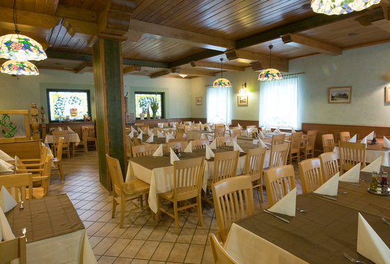
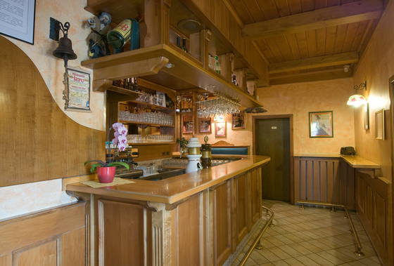
• Space
• Menu
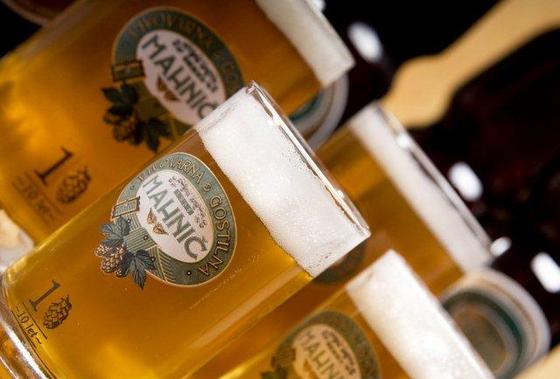
• Mahnič Beer
• Craft Brewery
• Food Photos
• Reservations
• News
Article is being prepared.
CONTACT
Pivovarna gostilna Mahnič d.o.o.
Kolodvorska 4, 6240 Kozina
> Map
RESERVATIONS
T 00386 5 6800 100
E
[email protected]
SOCIAL MEDIA
E-news
Facebook
Trip Advisor
Youtube
Instagram